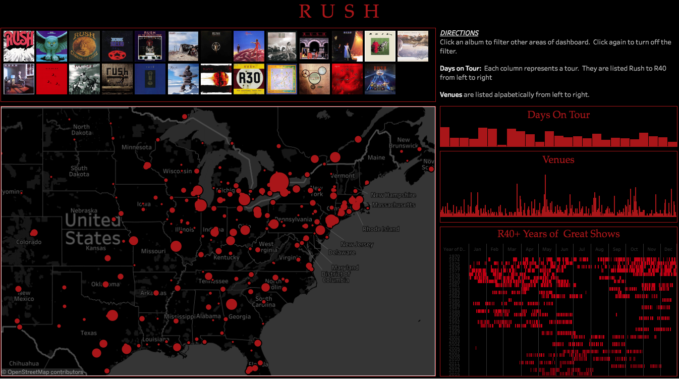
Rush is one of if not the most popular Progressive Rock band in the world. I have been a fan since about 1982 when I first heard Moving Pictures. Once that happened all other music took a back seat. Well A few years back they decided to officially retire. Insert Crying Here!!!
So realizing we would probably never get to see them perform again I decided to create a visualization using Tableau. Below is a dashboard that encapsulates all performances as published on Rush.com. There are a few gaps on cities that are not resolvable by Tableua but I am working on a remedy. Please feel free to request other pop culture dashboard on twitter @fanalytico.com.
